Backgrounds for your scientific posters: using the right images properly
Scientific posters should be eye-catching. Colors, graphs and images all help achieve this. The right background image used properly and combined with a nice selection of colors can really make a scientific poster stand out among others in the conference hall. So what is it that matters when it comes to selecting the right background images?
1. Dimensions and resolution
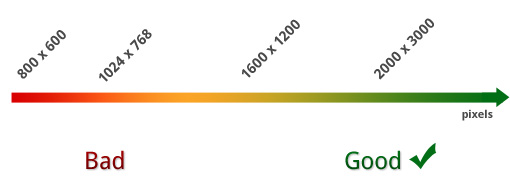
A scientific poster is usually large in physical dimensions. Therefore, the image to be used as a background should be large as well. Otherwise, upsizing or magnifying the image too much in order to cover the poster background will result in an ugly, pixelated result. Simply forget about images of 640 x 480 pixels; 800 x 600 or even 1024 x 768 will not work either. Instead, go for images with dimensions as big as possible: 2000 - 3000 pixels or above will do fine for most scientific posters.
A scientific poster is most often viewed from some comfortable viewing distance so, as long as your background image is large in physical dimensions, you need not worry as much about its extremely high resolution. In fact, unless you have a very fast computer you’re better off, not using very large resolution images of say, 300dpi with several thousand pixels per dimension as this will make your computer slow in previewing your poster. Providing such photographic detail is really unnecessary, since rarely will anyone look at your poster with a magnifying glass at the conference hall.
Shooting your background images with your digital camera
If you are going to shoot an image with your digital camera since we are talking about posters, which are big documents, the more megapixels the better so always shoot at the maximum megapixel-range supported by your camera. As a rule of thumb, any decent digital camera of 6 MP and above will suffice for most scientific posters.
Save the image at the most lossless file format and quality setting supported by your camera, rather than choosing higher compression in order to save up memory card space for more photos.
Scanning images
Things get a little more tricky if you are going to scan an image to use as background. In such a case remember to use the highest resolution setting your scanner supports; if it can scan at 600dpi or more, go for it. The reason for this is that most scanners are A4 or A3 in size while most scientific posters are significantly larger than that. As a result, scanning images for use as backgrounds most of the times will eventually necessitate some upsizing of those images to cover the poster surface. Having a very high resolution of your original A4 or A3 scan, will allow you to upsize it in order to cover the poster surface without too much degradation in quality or a coarse "pixelated" image.
2. Complexity
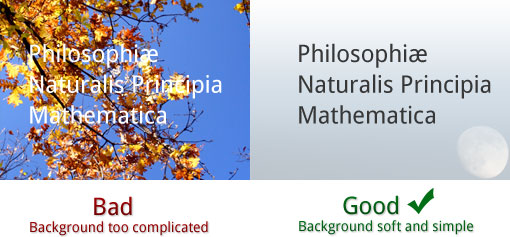
Do not use too complex images as backgrounds. Instead try using abstract ones. Complex backgrounds will distract the reader’s eye and will reduce the readability of your content ending up in making your poster less successful in its primary role: effectively communicating the results of your research. Assume your poster is about molecular biology. Rather than using a panoramic photo of a team of researchers looking through microscopes over their laboratory benches with hundreds of petridishes and tens of little vials, try using the colored close-up of a cell as seen through a microscope, or something similarly abstract and distinct.
3. Relevance
Keep your background image relevant with your topic or field of science. Do not use an image of a tree if your poster is about cardiac surgery. However, you don’t be anxious to strictly adhere to the very topic either. If your topic is atmospheric pollution you don’t necessarily need an image of a dozen chimneys emitting gloomy, black smoke; chances are also that it will be way too complicated and as we said above we don’t want this. An image of the sky perhaps with some nice looking cloud formations will serve you much better.
4. Contrast with content
To be easily readable your content should contrast with your background. Deep blue letters on a dark background are not going to be legible and people will probably not even try to read your poster. If your background is dark, your content should be bright and the reverse. Otherwise, make it brighter by reducing its opacity. Most times you will also be using different colors for background and foreground, such as white text on bluish background or the opposite. If you are experienced or confident about your eye for design, do dare to play with different shades of the same color as well. Dark blue letters on a light cyan background is a fine example of this and when carefully done the final outcome may look impressive. However, remember to try some test prints before sending the final poster to the plotter; you don’t want to identify problems on the final printout the day before setting it off to the conference.
The PosterGenius templates
To ensure high readability, to preserve the esthetic quality and minimize printout-related problems PosterGenius includes a library with some of the best templates for scientific posters around. Every template is a multi-parameter model including a color scheme, background and decorative graphics as well as a series of other typographic parameters, like font-size and line-spacing, all of them thoroughly researched, assessed, implemented and tested to create a harmonious and communicative result when the template is used as is, with minimal effort on the user’s part.
Still, PosterGenius provides ways so that you may customize those templates, like inserting and adjusting your own background images as well as adjusting the color schemes, in order to better serve your taste and needs.

Latest articles

Beginning January 1, 2019, support for PosterGenius has ended.
No further maintenance updates, technical support, or product downloads will be available. Tutorials and FAQs will continue to be available on our website


Connect with us
Stay updated on offers, new stuff,
poster presentation tips and events.


