Your scientific poster should be informative and easy to read
An effective scientific poster should promote your work and engage fellow conference attendees in a constructive conversation with you once they read it. This helps your professional development and can build the foundation for new collaborations. The reverse is also true. Posters that do not attract attention and do not yield productive discussions obviously do not adequately promote you or your work. So what is one of the most common reasons why some posters simply fail to create enough interest?
A scientific poster that is difficult to read is not effective
A poster is a visual tool and as such should rely on the principles of graphic design. As one of the greatest contemporary graphic designers says:
Peter Bilak - Illegibility
Imagine you’ve worked weeks, months or even years researching your topic, trying to understand your data and yield results and here you are; proudly showing up at the conference hall with the fruit of your hard labor: your poster. The poster session starts, you pin your poster on the board and you wait for colleagues passing by to ask you questions, constructively critique your methods, share their opinion of your results and even get inspired to discuss ideas for future research. Instead, you see them passing by, perhaps casting a short glance at your poster and moving on to the next one, all to your distress.
The most common reason for this is the appearance of your poster. It is probably difficult to read and doesn’t communicate information effectively. Unless it is of utmost importance or relevance to their own work, people will most of the time not try very hard to read through your content and identify the key points, if your poster doesn’t make it easy for them. Instead they’ll move on to other posters and stand before the ones that are most eye-catching.
Most of the time, this is not directly related to the quality of your work or the importance of your research. Instead it comes down to the following two issues:
- Content that is difficult to read, and
- Poorly organized content that is hard to follow and easily identify the key points.
Both issues render your poster non-communicative and therefore ineffective. What can you do to avoid this?
Make sure your text is easy to read and informative
What is a key factor in making your poster easy to read at the conference hall? Remember, people will stand some distance from your poster. This simple fact is easy to forget when you’ve been working on a poster for some time.
It’s all about good use of typography and it mostly comes down to four aspects: a) font-size, b) “paragraph typography”, c) content-background contrast and d) the proper use of emphasis to bring out the main points.
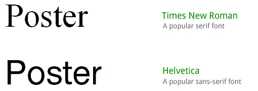
a) Font-size. Your text should be big enough to be read from some distance. Most common distances in a conference hall range from 4 to 6 feet. Depending on whether they are "serif" or "sans-serif" (serif fonts are more readable in blocks of text at small sizes) as well as their other design details, different fonts may offer different readability from a certain distance. In fact, even the font size is not the sole factor when it comes to readability as explained below.
b) Proper “Paragraph typography”. There is more to good readability than font-size.
This includes proper line-spacing, paragraph-spacing and line-length. More on line-length and its influence on your poster can be found in the "Choosing the right number of columns for your scientific poster" tutorial. For line-spacing, most of the time you will want to use 125% to 150% of the font-size, so for a font-size of 30pts, you should use line-spacing between 38pts and 45pts (or simply 1.5 or 150% in some programs). To separate paragraphs avoid using double “enter” or “return” on your keyboard. Instead, set a paragraph space of about 80-100% of the font-size you use for your main text. For example, for a font-size of 30pts use a paragraph space between 24pts and 30pts.
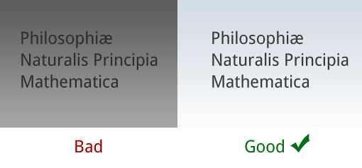
c) Content-background contrast. When it comes to contrast, it is not the actual color that matters, like “blue” or “green” etc. What we mean by content-background contrast is essentially the “shade” or “lightness” of the text as opposed to the “shade” or “lightness” of the poster background. Those two should significantly contrast each other. Blue text on a black background will most likely not work and your poster will be difficult if not impossible to read. White text on a yellow background won’t do either so pick your color scale carefully. For more details, take a look at the tutorial “Backgrounds for your scientific posters: using the right images properly”.
d) Proper use of emphasis. Do not overuse emphatical text-formatting. People sometimes use red or orange in some of their text to emphasize. In fact though, practices such as red-colored text is a no-no as it makes text difficult to read. If emphasis is what you seek, use bold, italics, or even underline. In the 21st century though, even the latter is an outdated relic of the typewriter era and does not offer much, so you’re better off with either of the first two ways of emphasizing: bold or italics. And remember: It’s best not use them together and definitely do not overuse them. A full paragraph in bold is, in fact, difficult to read. Instead, format only the sentences or words that really matter most and convey the message you want to send.
Layout your content in an easy-to-follow sequence
Since we are used to read and write from left to right, most people will intuitively try to scan your poster starting from the top left. Keep this in mind and start from the top left, laying out your sections in a conceptually logical order. Arrange all content in columns, and use a number of columns that is appropriate for the size of your scientific poster; for more on this please refer to the tutorial “Choosing the right number of columns for your scientific poster”.
Your “Introduction”, or “Background” or whatever you choose to name your first section should clearly start at the top left. The beginning and end of each section should be clear. Do not expect people to identify the order of your sections and you should not need to explain which section comes after what using arrows, numbers or other visual aids. Your reader’s eye should flow easily throughout the content. Sections, supporting information or anything of secondary importance should go at the end of the poster (that is the bottom right).
Typographical and layout automations in PosterGenius
If you are using PosterGenius to create your scientific poster you don’t need to worry about implementing the recommendations above. PosterGenius includes a library with some of the best templates for scientific posters around. Every template includes well-studied and thoroughly tested use of typography to ensure high readability and create a harmonious and communicative result when the template is used as is, with minimal effort on the user’s part. Further, PosterGenius includes a unique feature, which informs you of the optimal viewing distance for your poster’s readability (close-up of screenshot).
PosterGenius also features a powerful document-layout engine that arranges all your content in sequence, from top left to bottom right. For every selected number of columns it automatically handles the resizing, repositioning and re-alignment of all the content, including text, images and graphs.

Latest articles
Beginning January 1, 2019, support for PosterGenius has ended.
No further maintenance updates, technical support, or product downloads will be available. Tutorials and FAQs will continue to be available on our website

Connect with us
Stay updated on offers, new stuff,
poster presentation tips and events.


